Unifying an enterprise platform under one design system
Role-based information architecture and design-engineering pairing to bring an Enterprise Platform (Self-Hosted) onto a shared design system.
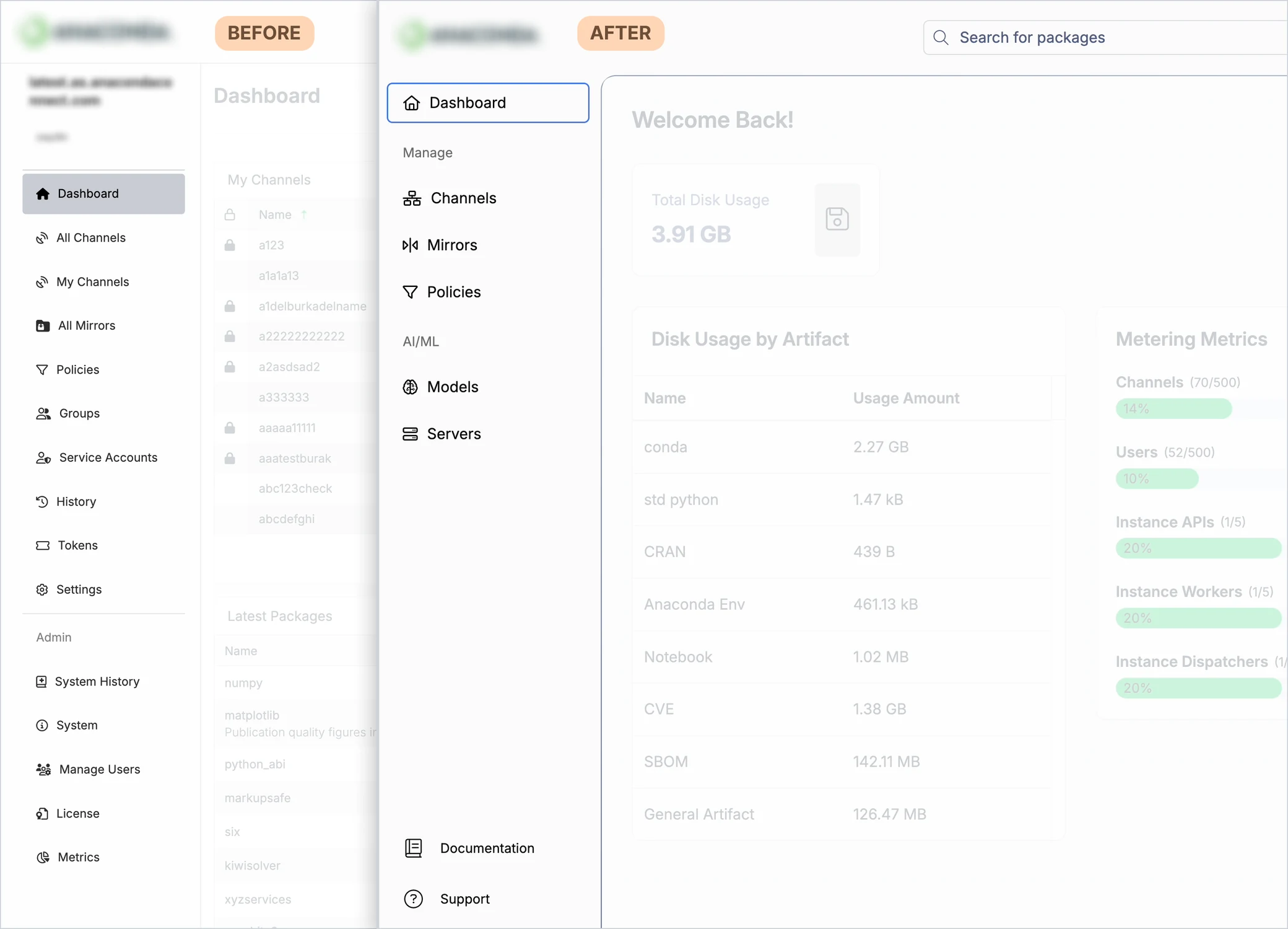
At a Glance
The Problem
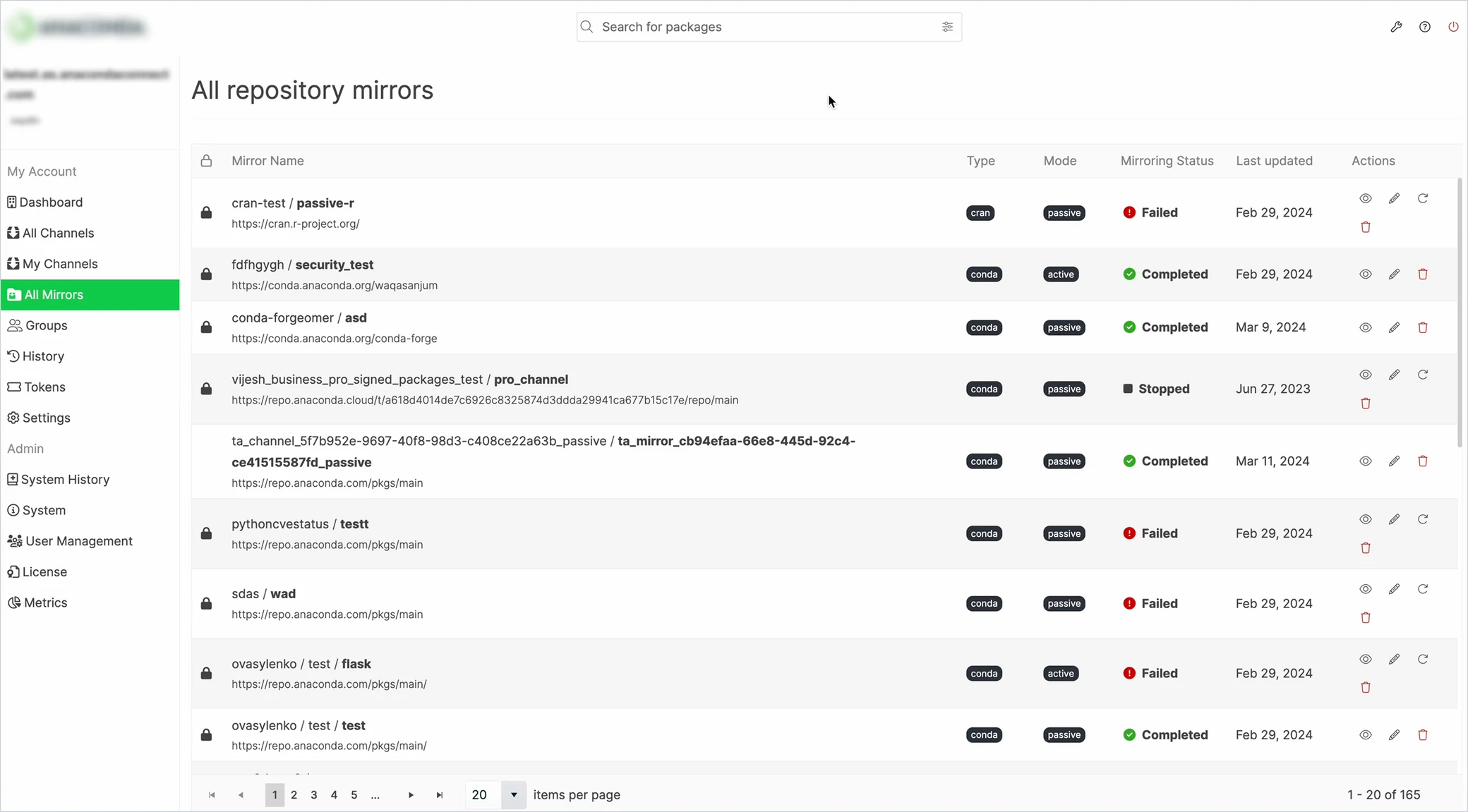
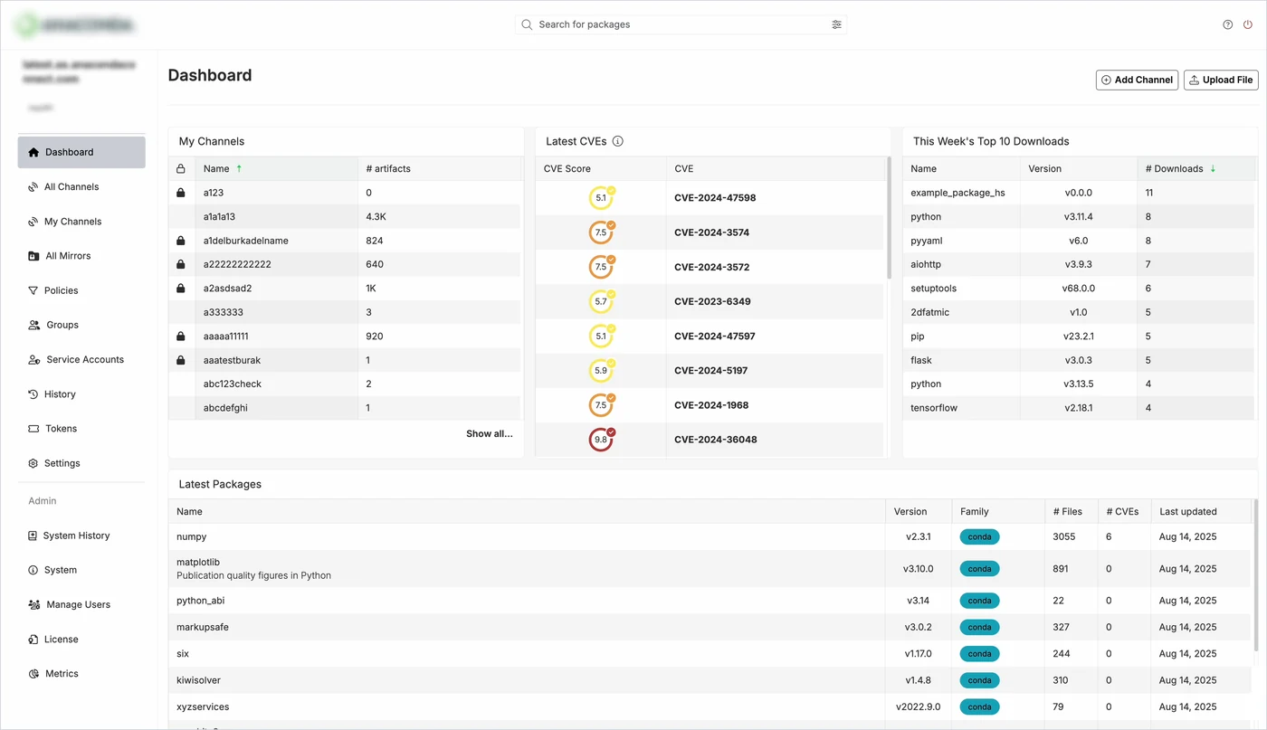
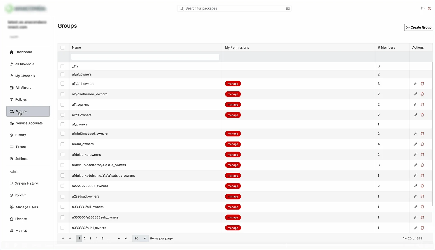
Built without UX, the product had outgrown its interface:
- 15 navigation items with no hierarchy
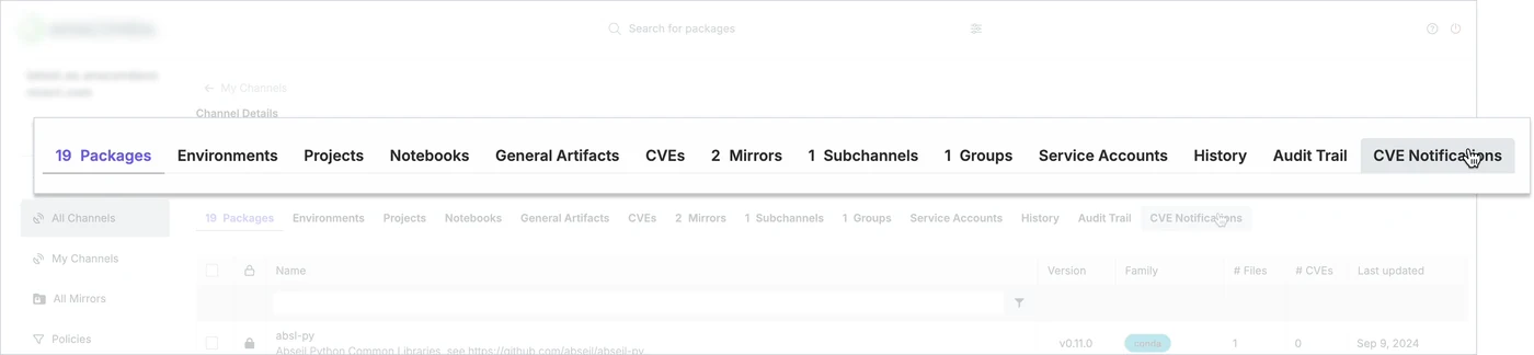
- 13 tabs on a single details page
- Red "manage" labels on nearly every row (though red signals danger)
It also looked and behaved differently from the company’s other products, including their desktop app.
The Opportunity
In 2025, a new Chief Product and Technology Officer made cross-product UX alignment a priority for the first time.
This product went first, making it the proving ground for the design system inside a complex enterprise product.
My Role
Lead UX Designer, embedded daily with product and engineering.
I owned the IA and design direction, facilitated key decisions, and paired with the team's lead senior front-end engineer.
The Users
Admins: IT and security staff who govern the platform.
Practitioners: data scientists and developers who use it every day.
One crowded navigation served both. Separating their experiences was an important principle of the redesign.
Constraints
- No new features: align and restructure without changing what the product did.
- A fixed deadline: about six months to a planned November 2025 soft launch.
- Legacy code and tech debt, with limited engineering capacity.
- A design system still being built, so some components had to be created along the way.
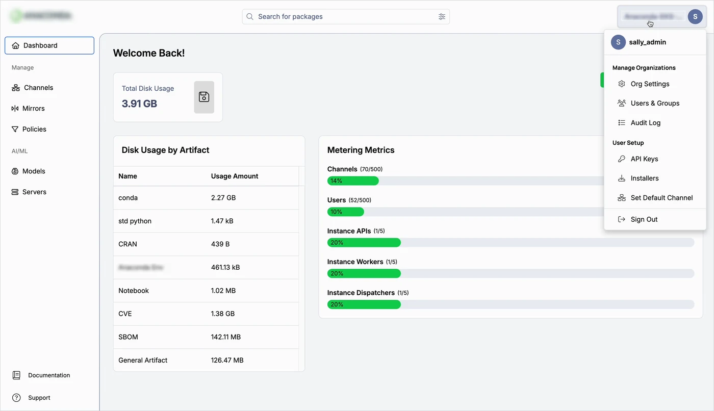
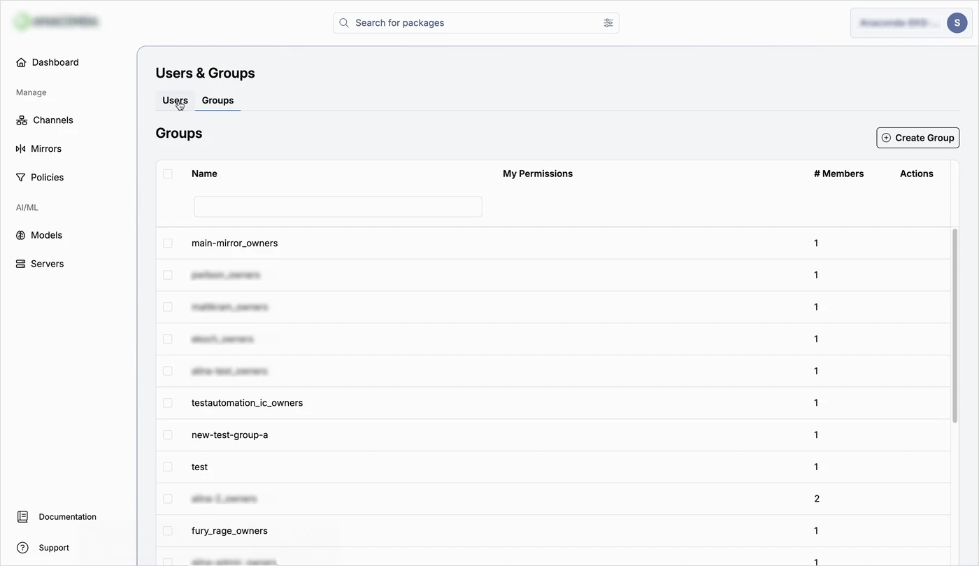
I split one crowded navigation into two role-based structures
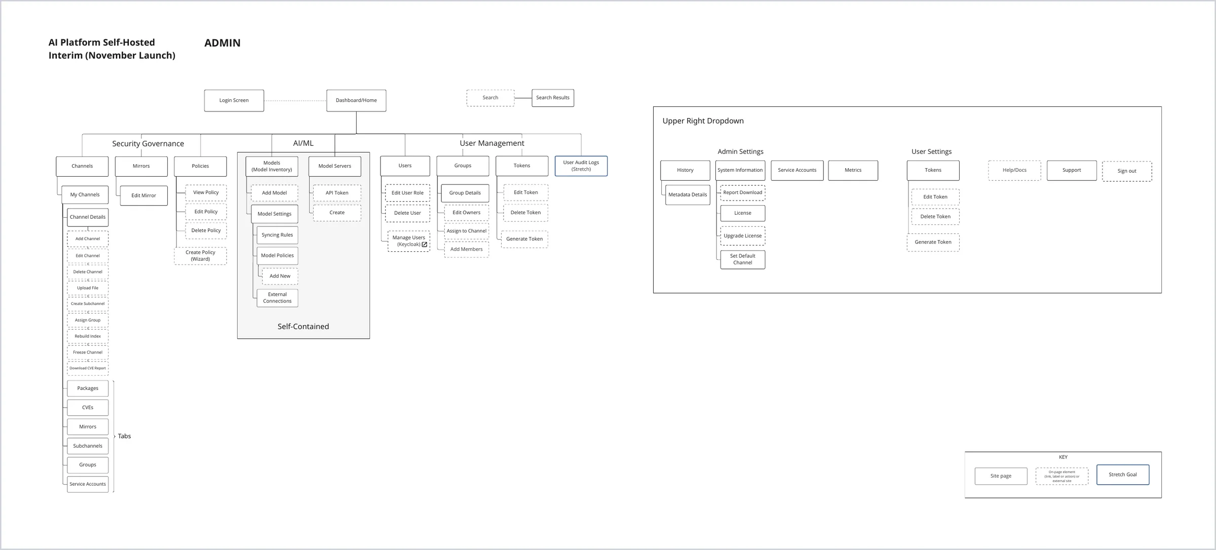
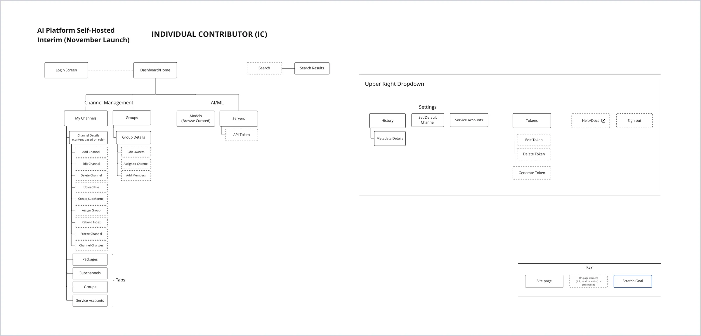
I designed one information architecture for Admins and one for Practitioners, mapping the pages, tabs, and actions each role needed.
Navigation went from 15 items to 6 grouped by category, and admin and account tools moved to a new user menu in the upper right. The IA also planned ahead for the product's new AI/ML areas.
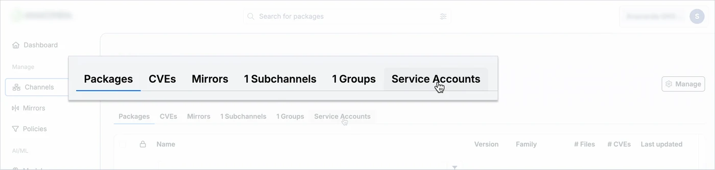
In one live workshop, the team cut 13 tabs to 6
I facilitated the Engineering Manager, two Product Managers, and several engineers through every tab on the channel detail page, capturing decisions in Miro.
The PMs' customer and usage data grounded each decision.
Any removed tabs moved to better homes and a few were merged, so nothing was lost.
Twice-weekly pairing let us fix inconsistencies at the pattern level
I proposed a pairing practice with the team's lead senior front-end engineer.
Twice a week, she brought screenshots of patterns that didn't match the design system, with her proposed fixes, and we decided together directly in staging.
A mid-project walkthrough built support at the top
In August 2025, I demoed the redesign live for the CEO and the VPs of Engineering and Product, who responded positively to the progress.
Outcomes
What I Learned
Testimonial
"She asked engineers real questions about the system, then used those answers to design experiences that were both delightful and buildable. She knew how to scope, how to ship something valuable now and make it better next iteration, rather than trying to boil the ocean."
— Engineering Manager, Web Experience team