Designing with AI: 3 short examples
How I use AI to move faster on real design work, and where my judgment comes in.
Wireframes for a careers hub in less than 2.5 hours
What I was handed
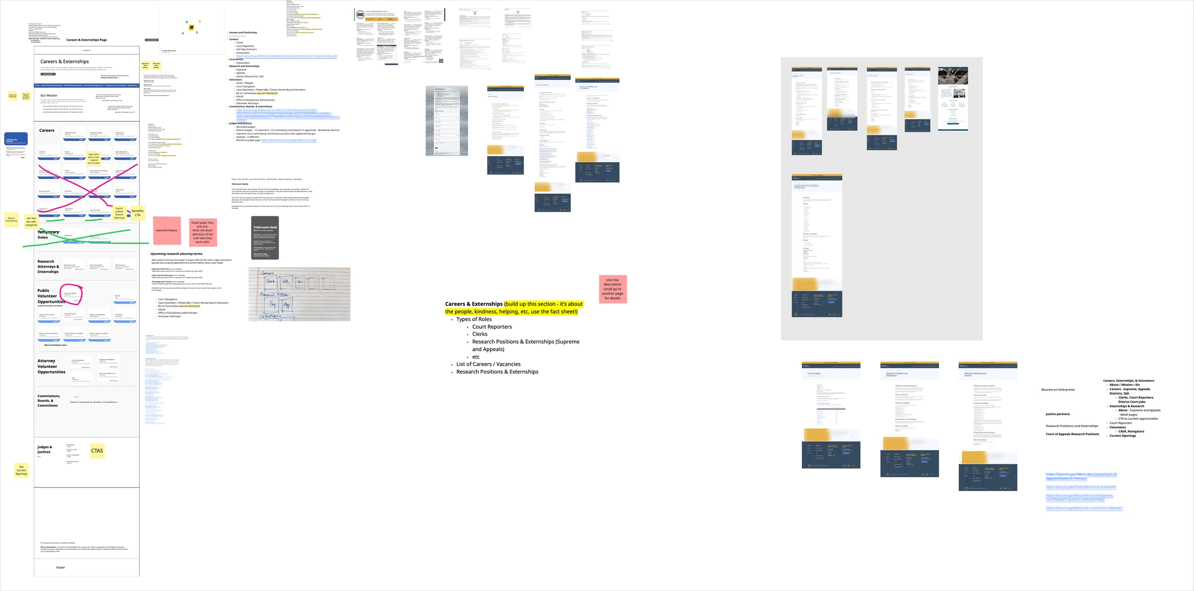
A client's working board: a long list of job titles, positioning notes ("public servants," "a higher purpose"), a rough section outline, and one long-scroll page sketch.
The raw material was there, without a structure. The court offered more than just jobs: paid careers, volunteer roles, student externships, appointed boards, judgeships, and contract work, all under one "Careers" label.
What I did first (no AI)
Discovery and inspiration in Miro.
- Career board patterns: side-by-side lists with a detail pane, card grids with filters, filters at the top
- Navigation models: left rails, top tabs with mega menus, and hybrids, from government, finance, and SaaS products
That board became the brief I gave to AI.
What AI did
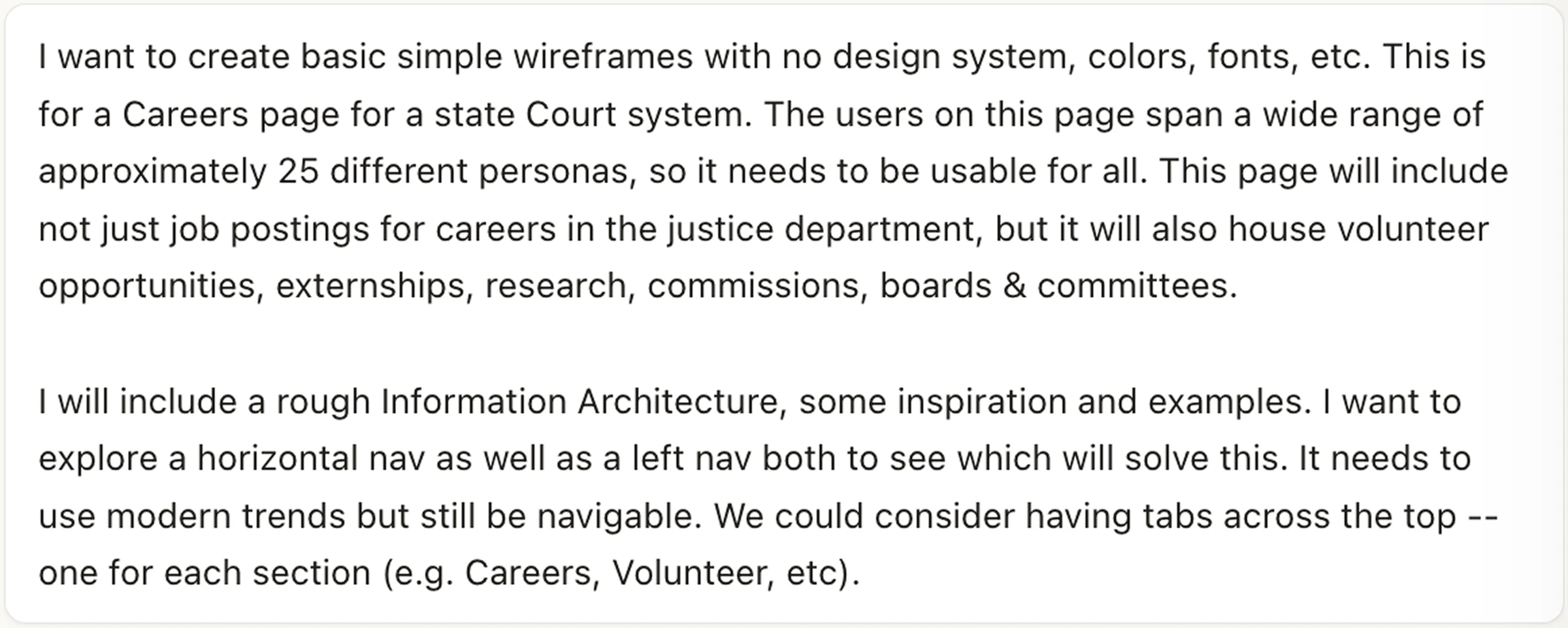
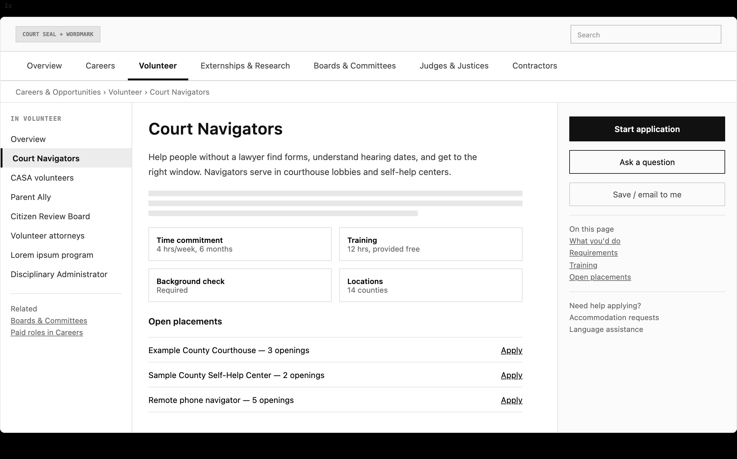
I wrote the prompt and handed Claude Design my research: a rough IA, inspiration, and examples. I asked for plain wireframes with no design system, for a page that had to work for about 25 personas and hold jobs, volunteer roles, externships, research, and boards. I also asked it to compare a horizontal nav with a left nav, including tabs for each section, so the structure could be judged before any visual design.
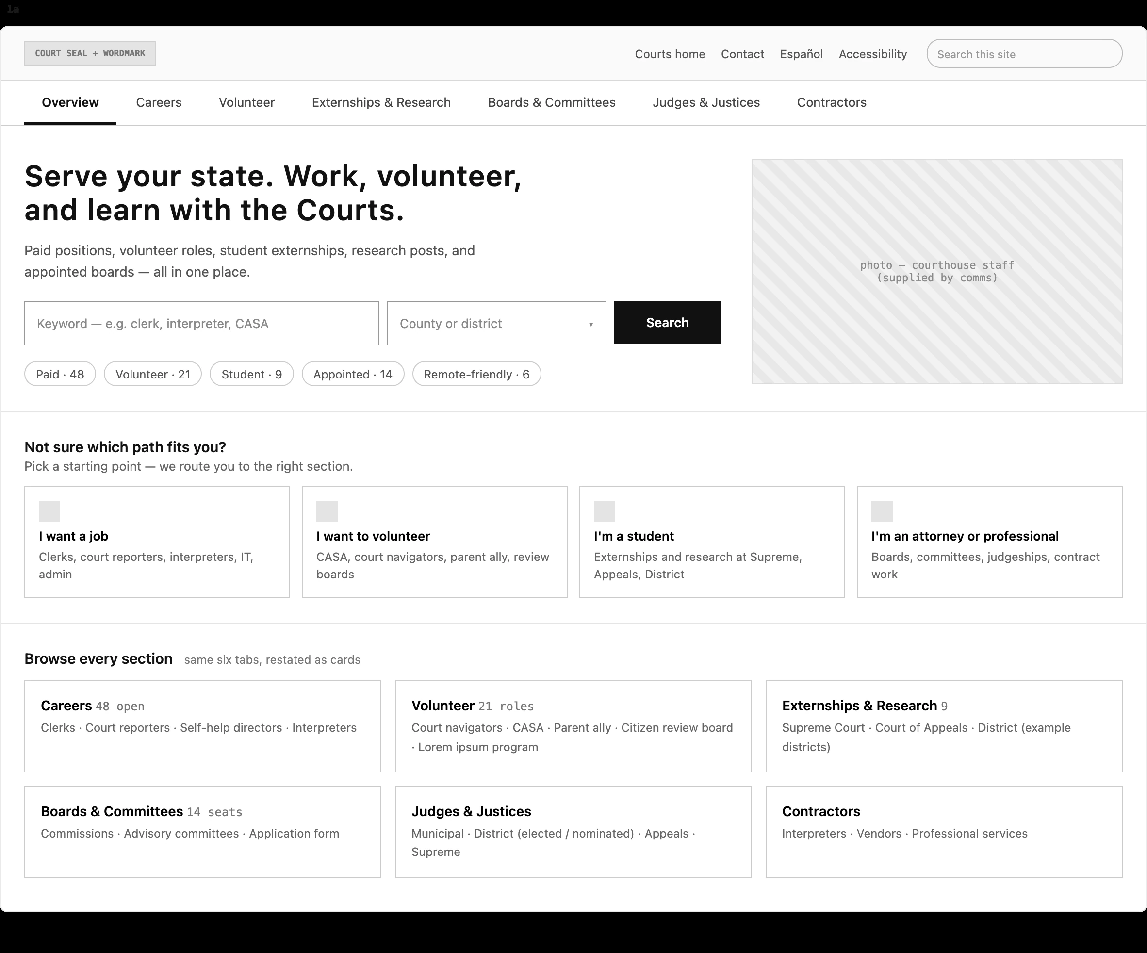
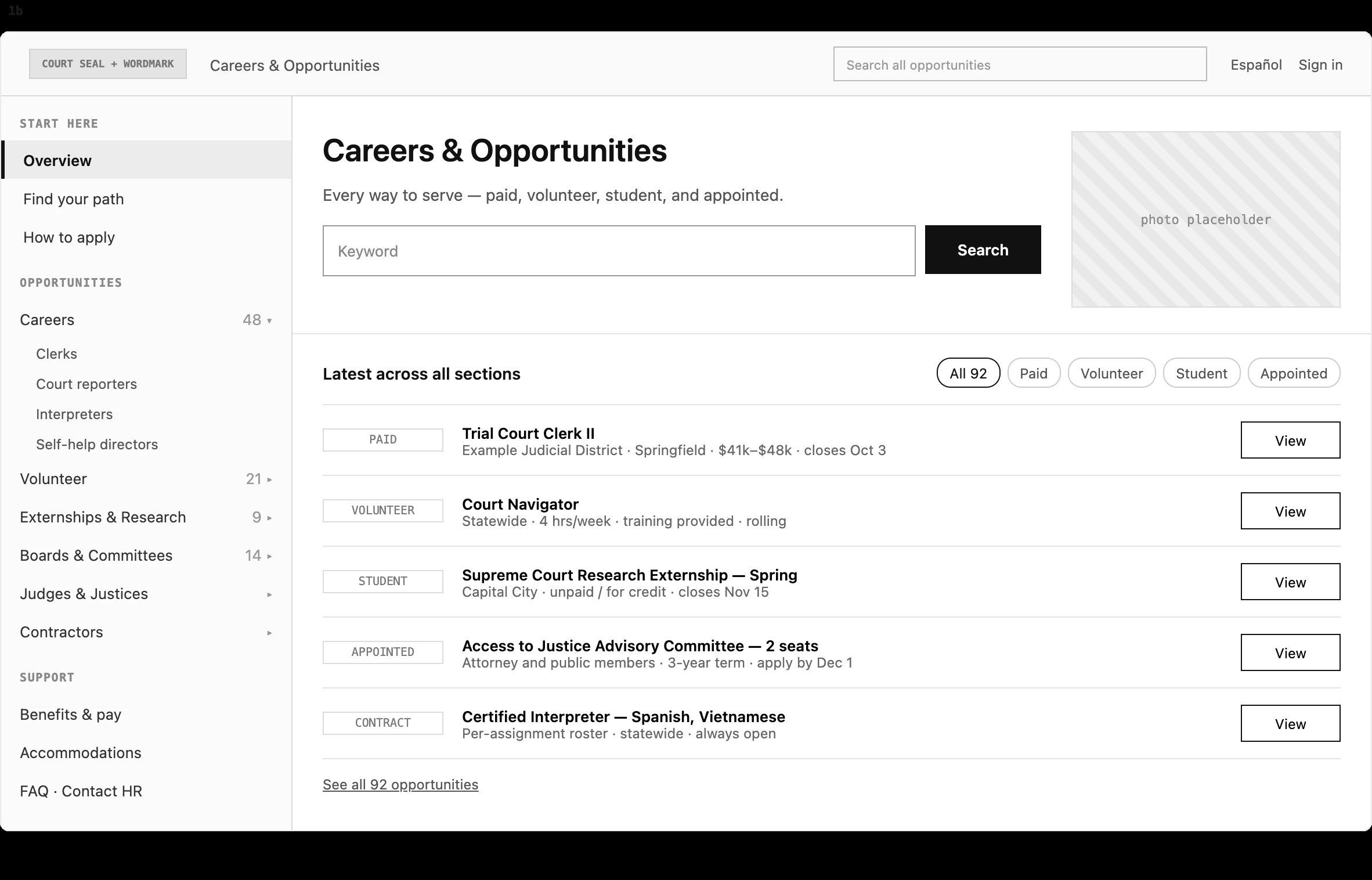
From that prompt, Claude Design produced three quick wireframes, each showcasing a different navigation model on the same content.
What I decided
Because my prompt was thorough and clear about what I wanted, Claude Design's first attempt was exactly what I was hoping for. I was satisfied with the first draft of all three options, so I used them to facilitate the conversation with my client.
The result
In a debrief, I walked the client through all three options and their trade-offs, then handed them to his team to make the final decision.
In two short sessions, his project went from a list of roles to three concrete, comparable directions.
Client Feedback
"This is exactly what I needed to continue the work with my team, thank you."
— Dan, contract client
A clickable prototype created from a PM's security vision
What I was handed
A product strategy represented in various documents. A PM shared a phased roadmap, a feature matrix of nine security capabilities, a detailed feature spreadsheet, and an example screen he liked.
He needed something he could click through.
What I did first (no AI)
I worked through the PM’s materials to decide which capabilities we should include, and how they mapped to things users already knew in the product: channels, packages, and environments.
What AI did
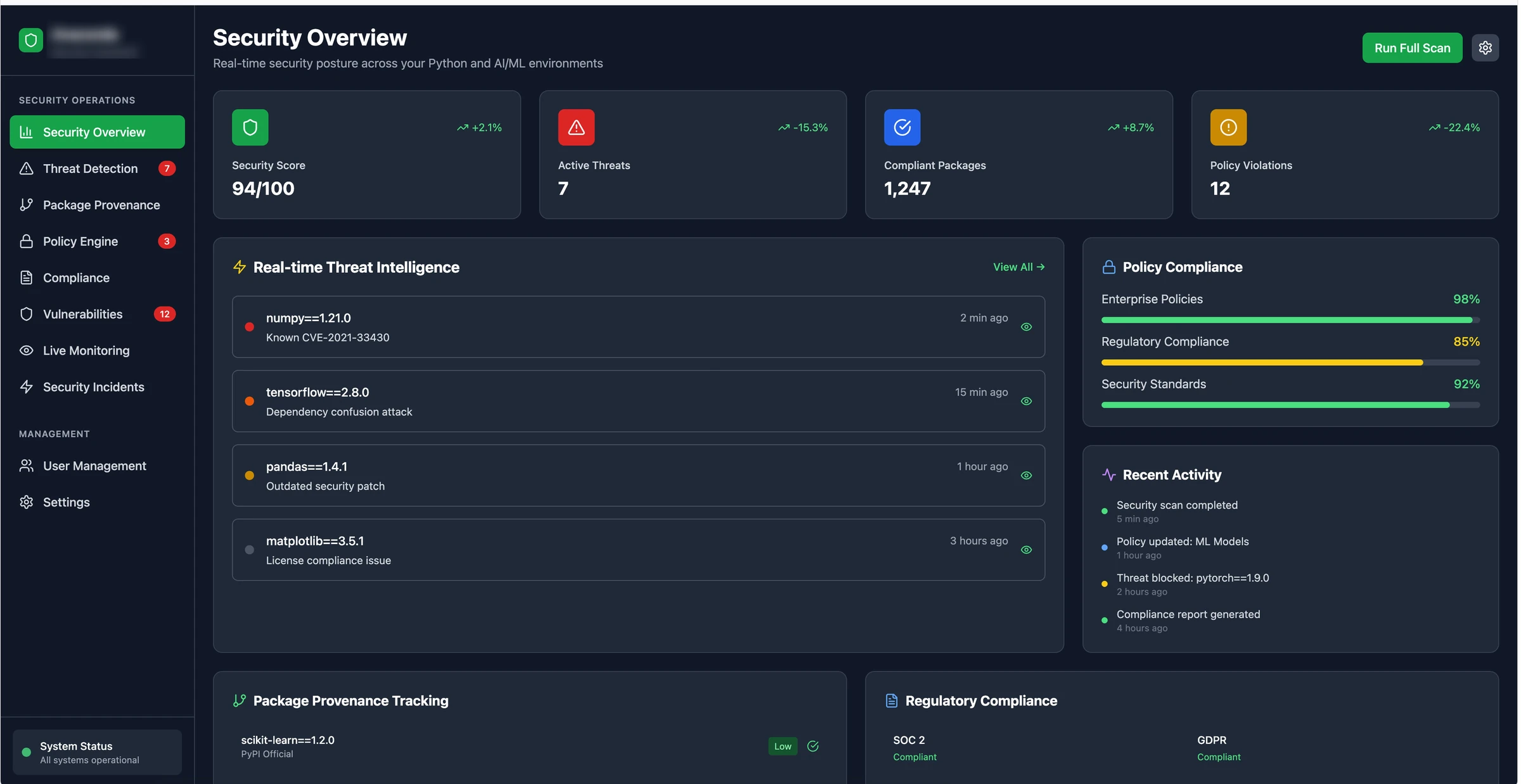
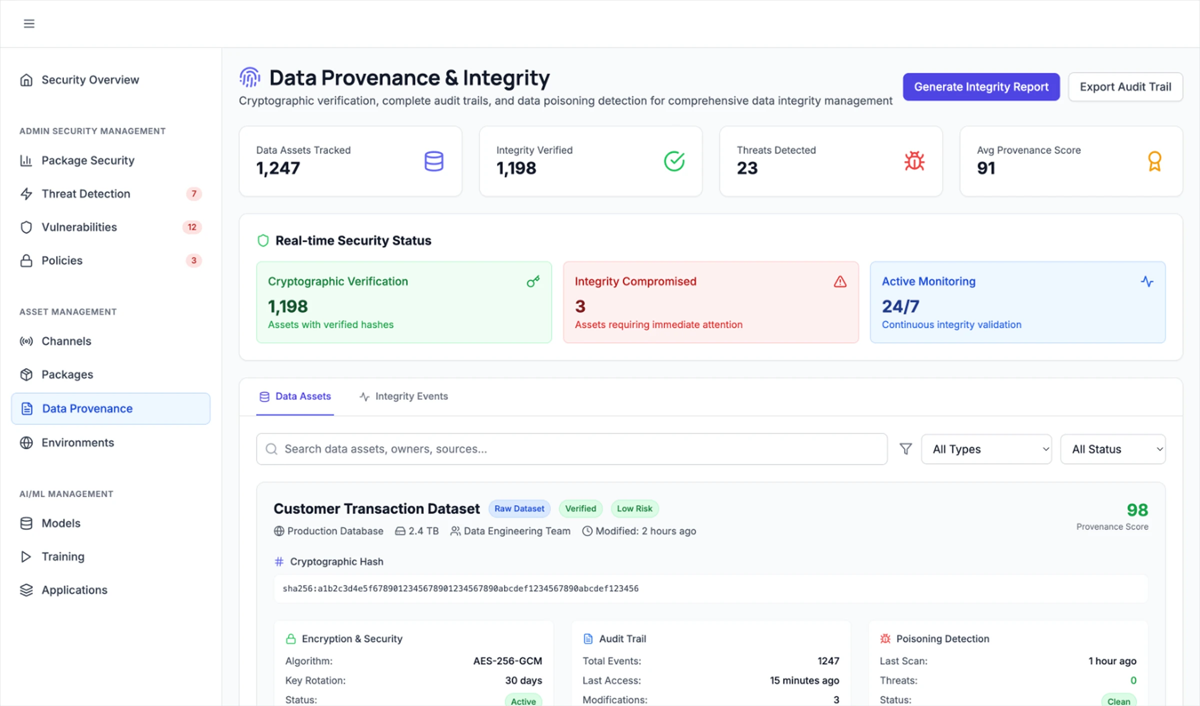
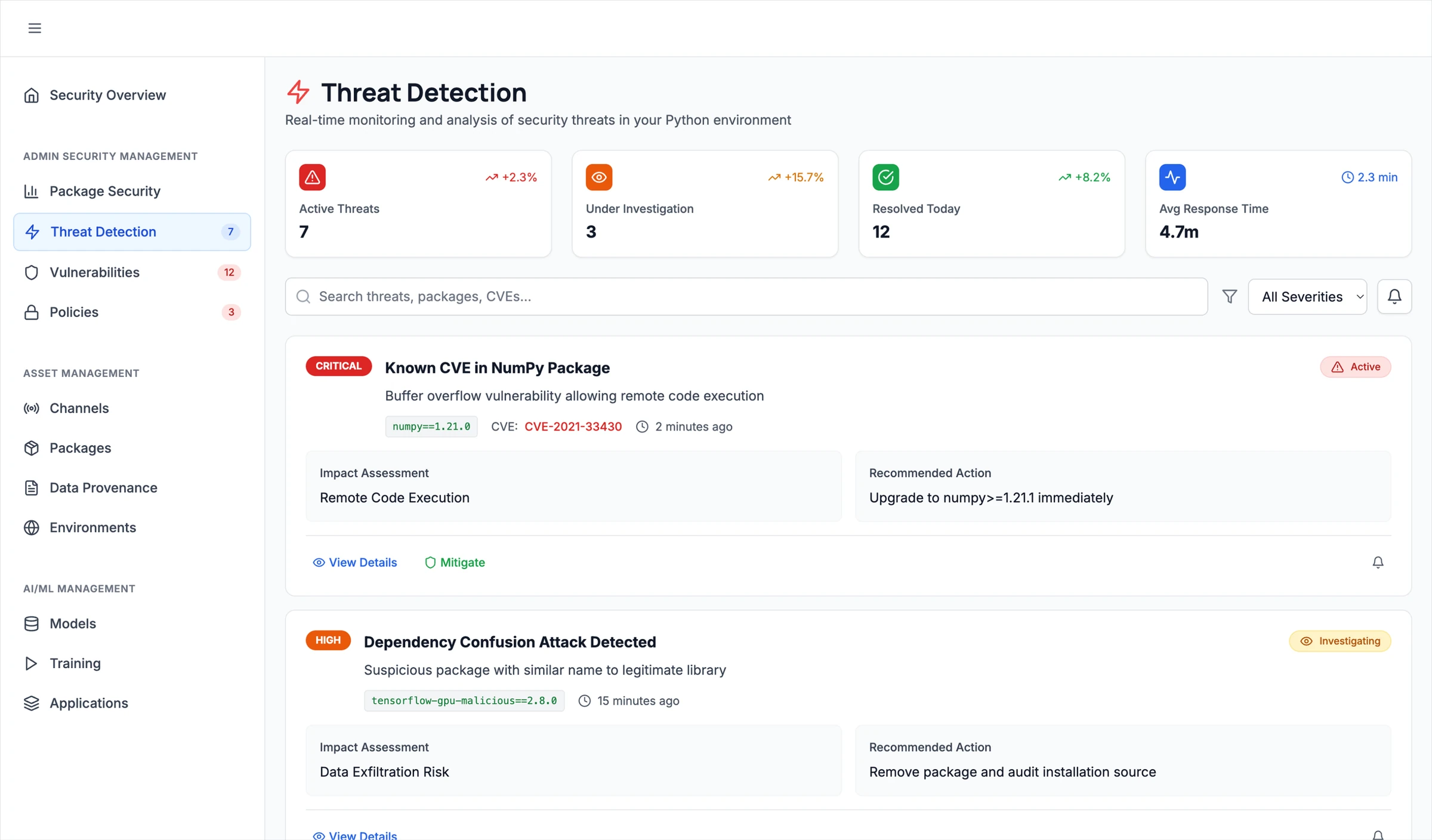
I wrote a detailed prompt directing AI to create a first pass. Bolt generated a working, clickable prototype with a security overview dashboard, threat detection, package security, and data provenance. The first pass came together well, but it needed refinement.
What I decided
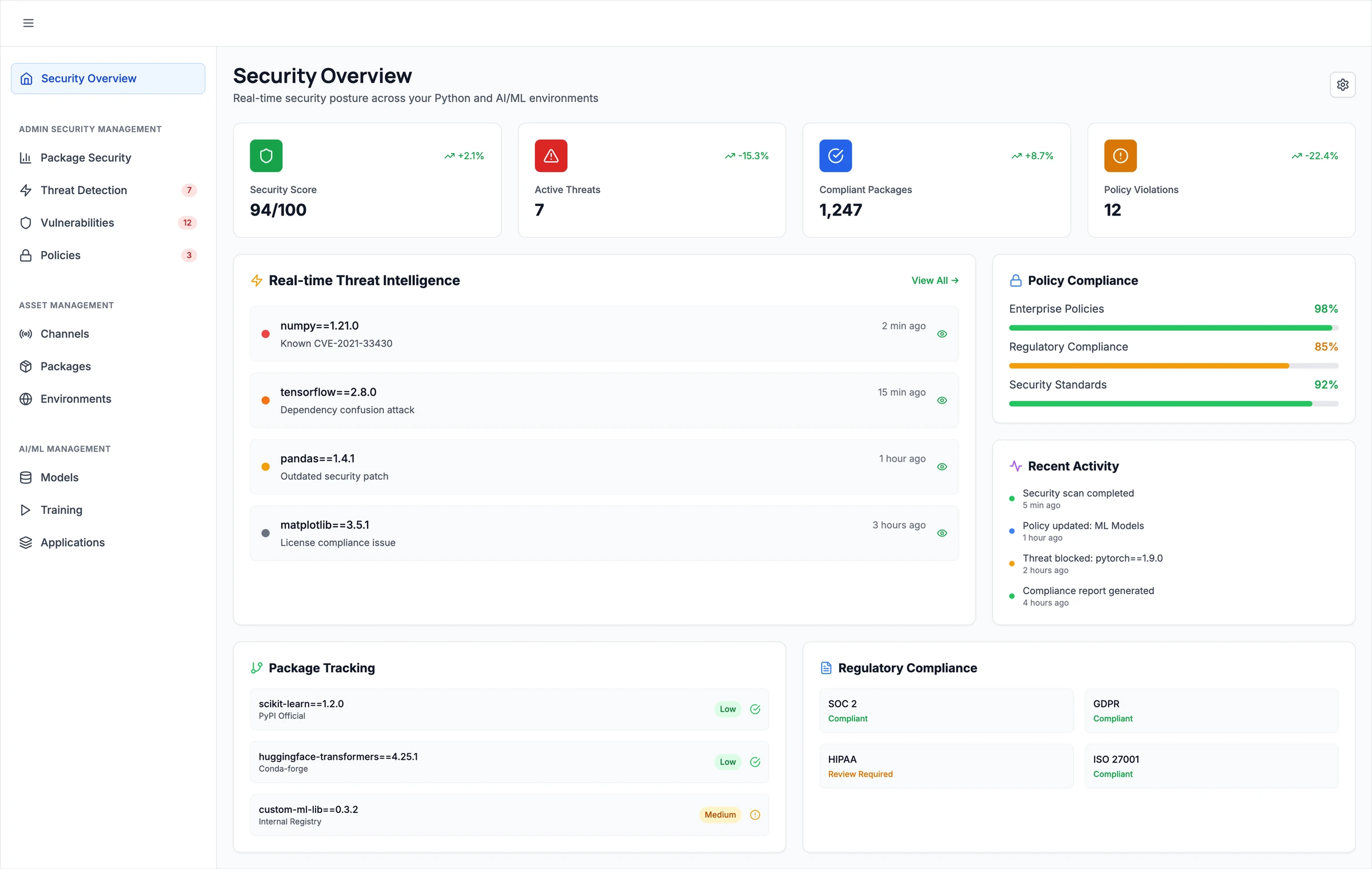
In a few hours of work spread over two weeks, I reshaped it:
- Regrouped the navigation into Admin Security, Asset Management, and AI/ML Management, following the PM's phased roadmap.
- Tied it to the real product's objects and structure, so it read as a potential evolution rather than a separate tool.
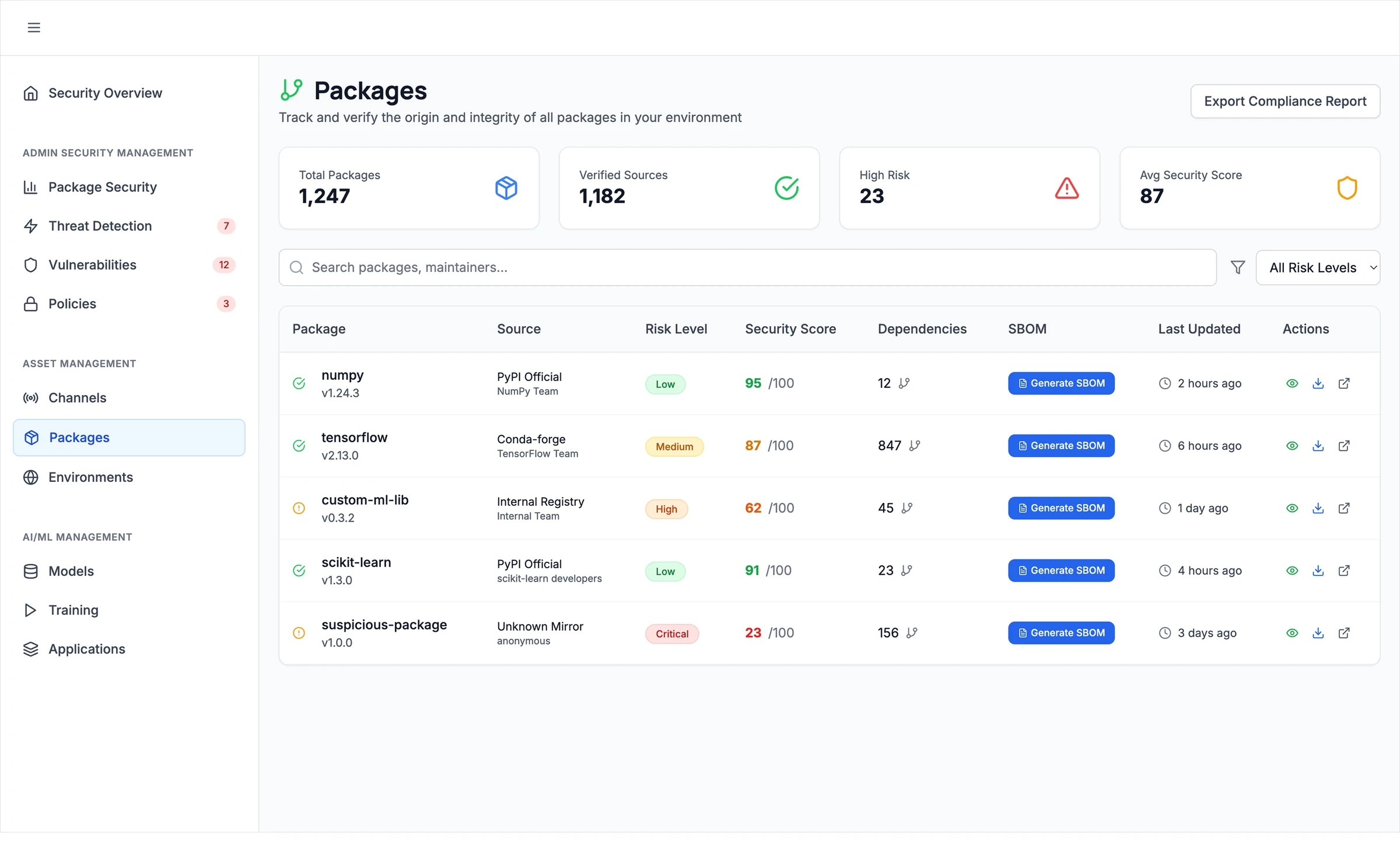
- Merged overlapping pages. Package Provenance folded into Packages, with SBOM generation built into the table.
- Added pages from his spreadsheet, like Data Provenance and Integrity, that the first pass skipped.
The result
A clickable vision the PM could share and react to, instead of a slide deck and a spreadsheet.
It was only an idea, though, and unfortunately it never went further. But what it did do was make the idea concrete enough to discuss.
Two slides created to illustrate AI in the UX process
What I started with
A description of what I wanted to show, a few slide examples, a written post that shaped my thinking, and the process document my team and I wrote on bringing AI into the UX process.
What I did first (no AI)
I decided the message: every phase of our process stays, AI assists inside each one, and a person makes the call at the end of each.
What AI did
Claude suggested directions, and after some discussion we built first drafts on a design canvas. Two options survived: layers that build on each phase, and a full vs. lightweight track.
What I decided
The first draft was too static. Instead of writing longer prompts, I marked up the canvas directly, moving elements and leaving sticky notes, like a design review:
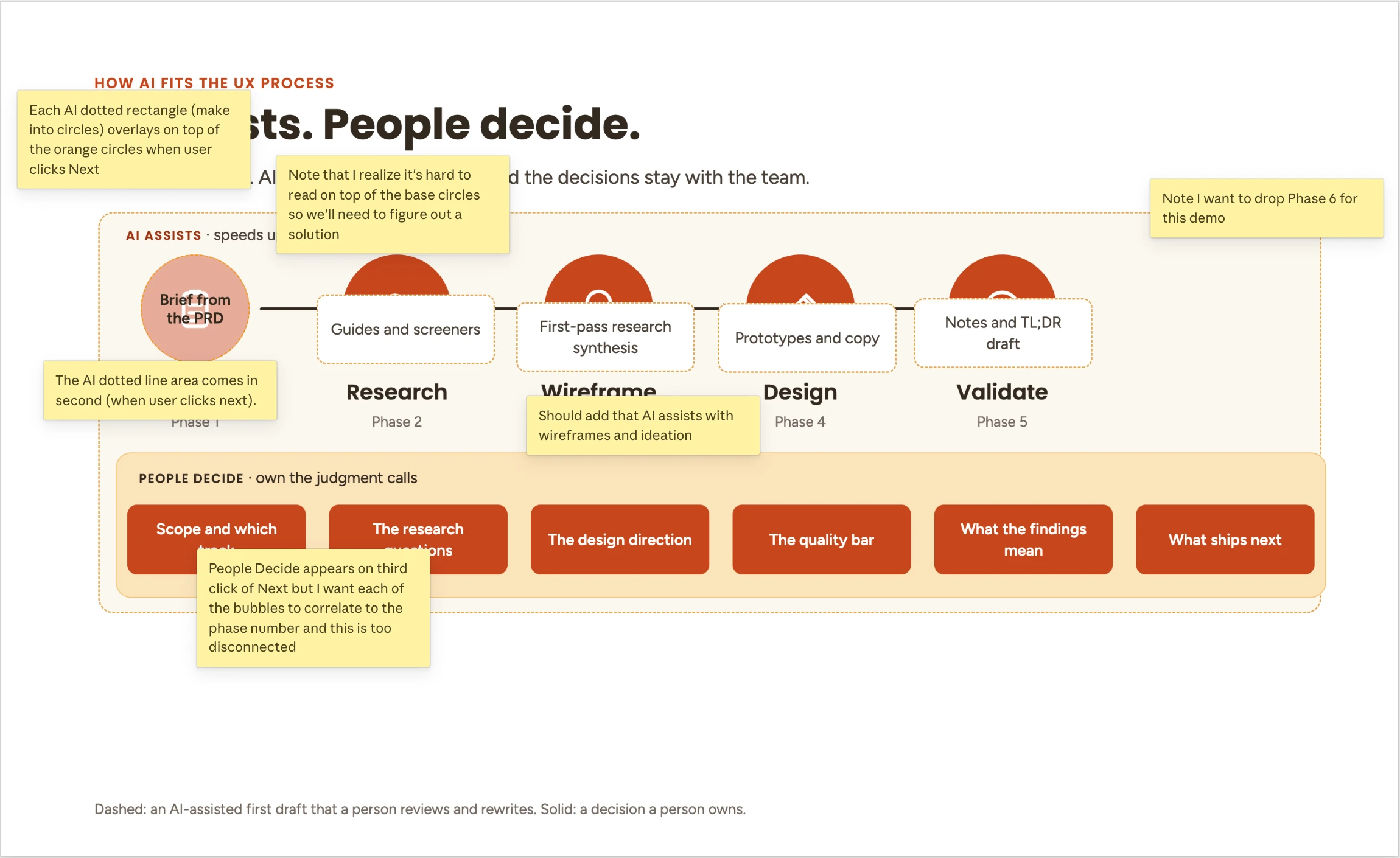
We iterated one slide at a time on animation, wording, and click order until it matched what I had in mind. The layered option went through three versions, and the track idea became a second slide: "Fit the process to the project."
The result
Two animated interview slides. I screen-recorded them, Claude converted the recordings into GIFs, and I placed them in AI in the UX Process to illustrate the story.